ggplot2: Going Beyond the Defaults
With ggplot2 - the ubiquitous tool for making plots in R - you can create beautiful data visualizations without doing much to the defaults. By applying the template below (see R for Data Science), adding a theme (e.g., theme_light()), and giving your chart custom labels, you can have a publication-ready visualization.
ggplot(data = <DATA>) +
  <GEOM_FUNCTION>(
     mapping = aes(<MAPPINGS>),
     stat = <STAT>,
     position = <POSITION>
  ) +
  <COORDINATE_FUNCTION> +
  <FACET_FUNCTION>
But the more I pay attention to how people respond to visualizations, the more I realize how minor improvements can make a major difference. Like cooking, where adding a little bit of salt or giving a dish a few extra minutes in the oven can transform a meal from acceptable to outstanding, relatively small changes to a chart can do the same.
Take the example below, in which one of Stephanie Evergreen’s clients started with the slide on the top, and she helped them create the one below it:
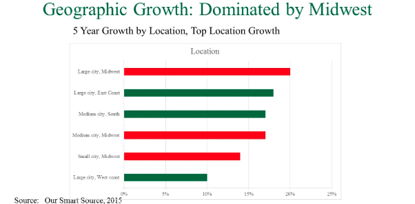
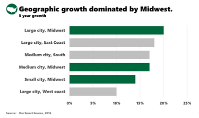
Both charts contain the same information, and even if you can’t express why, you just know the one on the bottom is better. Continuing with the cooking analogy, the charts are like two Mexican restaurants that use the same ingredients, but at one, the guacamole is fresher, the rice is more flavorful, and the tortillas are made in house.
ggplot2 was designed so users can build any plot that they can imagine, so as attractive as its defaults are, my goal with this series of posts is to venture beyond the minor design adjustments I typically make and learn to tweak charts from ordinary to outstanding. My first goal was to use ggplot2 to reproduce the chart that Dr. Evergreen created for her client, which based on her post, I think she did in Excel.
library(tidyverse)
library(scales)
library(cowplot)
Step 0: Create the Dataset
In addition to creating the data set, I used fct_reorder() so the bars will appear in order from highest to lowest growth in the chart.
growth <- tribble(
  ~region,               ~growth, ~group,
  "Large city, Midwest",     .2,   "Midwest",
  "Large city, East Coast", .175,   "Other",
  "Medium city, South",      .165,  "Other",
  "Medium city, Midwest",    .165,  "Midwest",
  "Small city, Midwest",     .14,   "Midwest",
  "Large city, West coast",  .10,   "Other"
) %>%
  mutate(region = fct_reorder(region, growth))
Step 1: Make the Foundational Chart
This chart contains all of the information that the final chart contains, but it’s like the decent restaurant you’ll never return to: fine, but unmemorable. In this step, I also narrowed the width of the bars, a subtle alteration that improves the feel of the chart as it gets closer to the finished product.
(p <- growth %>%
  ggplot(aes(x = region, y = growth, fill = group)) +
  geom_col(width = .7) +
  coord_flip() +
  labs(x = NULL, y = NULL,
       title = "Geographic growth dominated by Midwest.",
       subtitle = "5 year growth",
       caption = "Source: Our Smart Source 2015"))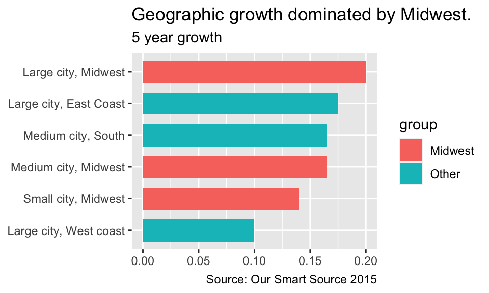
Step 2: Update the Colors and Remove the Legend
Even if you like the default ggplot2 colors - which I very much do - putting a dark color next to a muted color does a better job of highlighting a conclusion you might want to draw attention to. And by juxtaposing the green and gray, in combination with the chart’s title, the legend becomes extraneous and can be removed.
(p <- p +
  scale_fill_manual(values = c("#4D643D", "#D7DBDD")) +
  guides(fill = FALSE))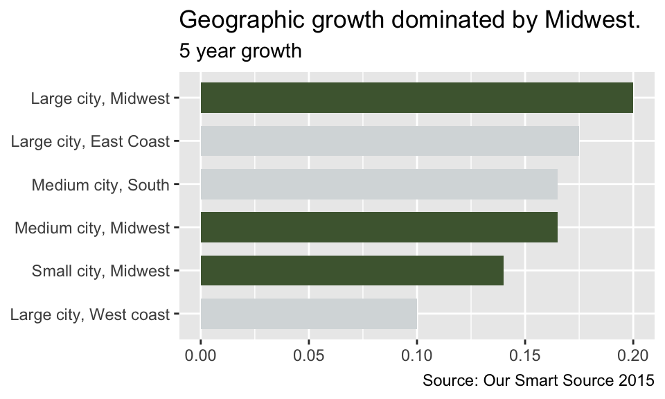
Step 3: White Background and Minimal Gridlines
The white background can be achieved using theme_minimal(), and removing all of the grid lines other than the major-x ones cleans up the look of the chart.
(p <- p +
  theme_minimal()  +
  theme(panel.grid.minor.x = element_blank(),
        panel.grid.major.y = element_blank()))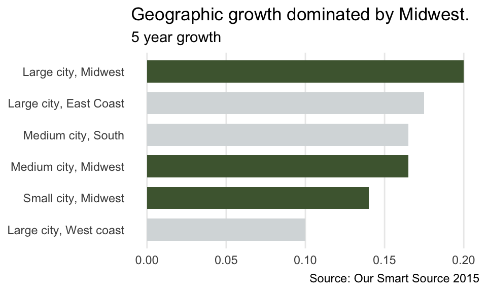
Step 4: Change Font and Convert Axis to %
Taken together, using a lighter color for the axis text and bolding the labels, make the chart look more professional. It’s so easy to rely on ggplot2’s default font choices that it’s also easy to forget that changing them can give your chart a completely different look. In this step, I also expressed the axis as percents, which is more consistent with how people think about growth (and happens to look better).
(p <- p +
  theme(plot.title = element_text(face = "bold"),
        plot.subtitle = element_text(face = "bold"),
        plot.caption = element_text(color = "gray53", hjust = -.15,
                                    face = "bold"),
        axis.text.y = element_text(color = "gray30", face = "bold"),
        axis.text.x = element_text(color = "gray30", face = "bold")) +
scale_y_continuous(label = percent_format(), limits = c(0, .25))) 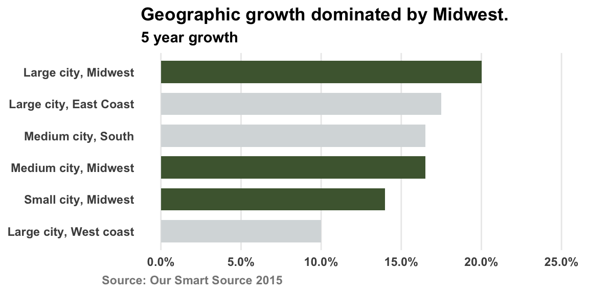
Step 5: Add an Icon
The logo - which I added using the cowplot package - is functionally unnecessary but aesthetically powerful. It is the cilantro garnish on top of your beans and rice: Doesn’t add much flavor, but makes you all the more eager to dig in!
ggdraw() +
  draw_image("us-map.png",
             y = .85,
             x = 0.1,
             width = .15,
             height = .15
           ) +
  draw_plot(p)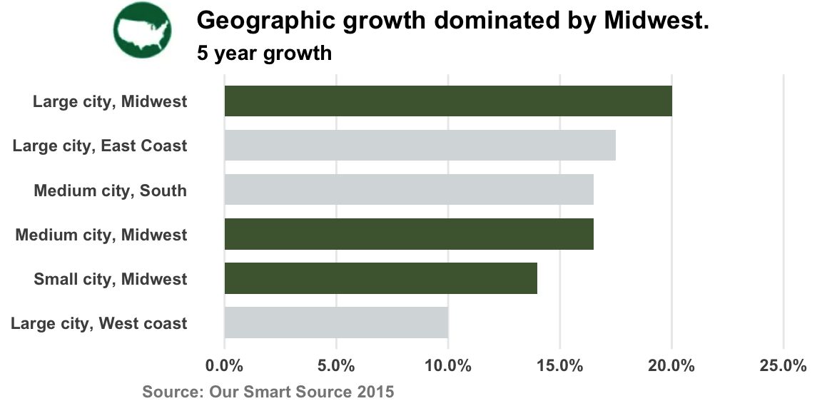
Conclusion
ggplot2 has become so popular that I rarely, if ever, search online for a question about it that hasn’t already been asked and answered. This task was no different, with each question I had (e.g., how do I add an icon?) quickly resolved with a StackOverflow solution.
Small adjustments make a big difference, and the beauty of ggplot2 is that those adjustments are not only possible, but the knowledge to accomplish them is accessible (RStudio Community, R for Data Science, etc.). Stay tuned for more tricks on how you can make your ggplots more interpretable, compelling, and visually satisfying!